COMPANY PERFORMANCE ANALYSIS

Cohort Retention Analysis

Consumer apps live or die on retention. Here's how to use AI to see cohort retention across the portfolio, compare decay shapes, read the cohort triangles, and diagnose why it's happening.

AI prompts for quarterly fund marks movers
  1. Score Every Consumer PortCo on Retention

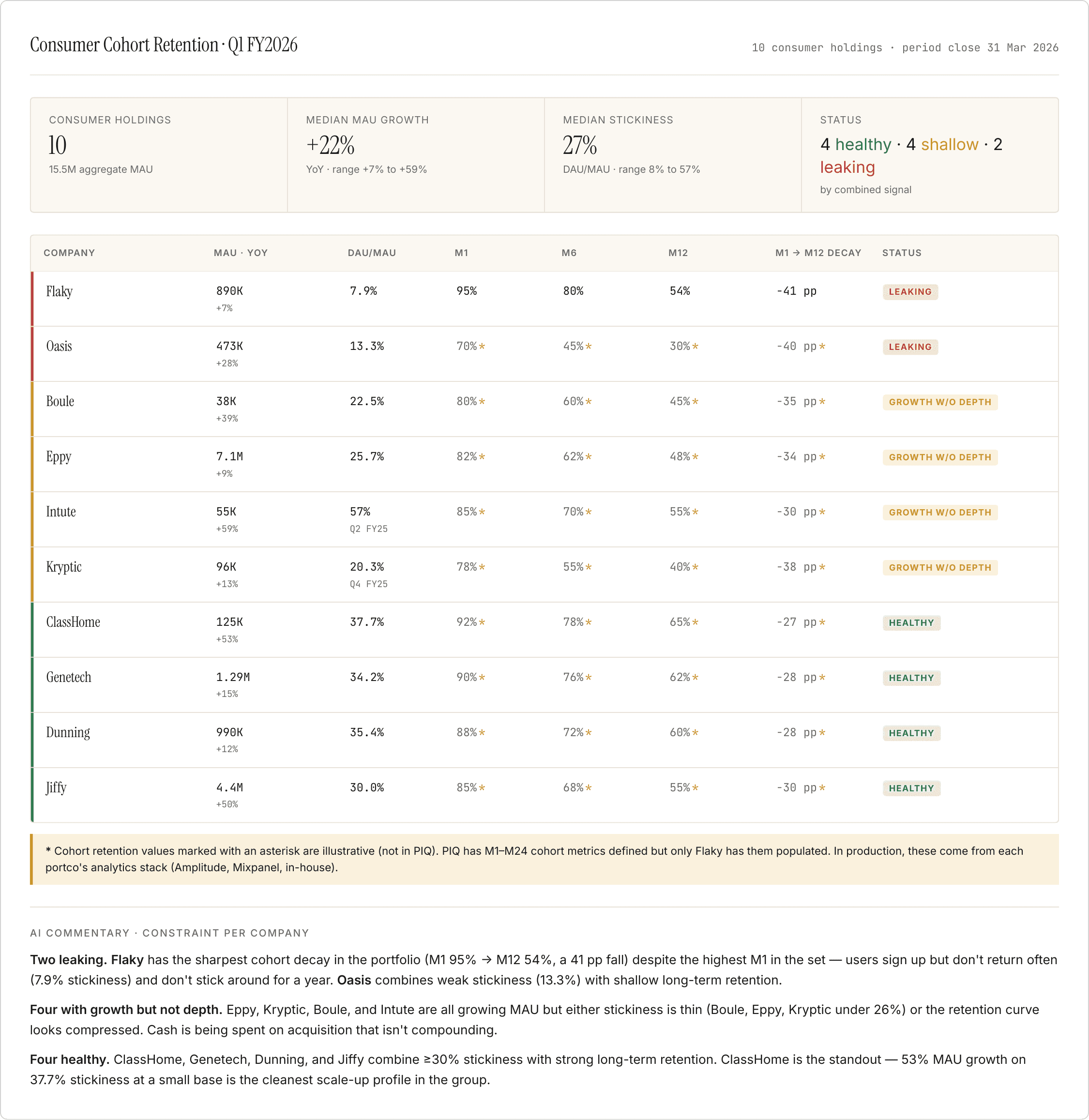
One row per consumer holding. MAU growth and stickiness on one side, cohort retention (M1, M6, M12) on the other. The gap between them names the shape of the problem.

Prepare your data

MAU, DAU, WAU per company for the latest quarter. M1, M6, M12 cohort retention (from the analytics stack — Amplitude, Mixpanel, or in-house).

Prompt

For each consumer portco, render one row with: - MAU (current quarter) and MAU YoY change - DAU/MAU stickiness (current quarter) - M1, M6, M12 cohort retention (most recent cohort with a full window) - Status — classify by the *combination* of MAU trend, stickiness, and retention curve: * Healthy — growing MAU, stickiness ≥ 25%, M12 ≥ 55% * Growth without depth — growing MAU but stickiness < 25% or M12 < 45% (users acquired, not retained) * Leaking — MAU declining OR M12 < 40% (retention front failing) Sort by status (Leaking first). Add an AI commentary section naming the specific constraint per company.

For each consumer portco, render one row with: - MAU (current quarter) and MAU YoY change - DAU/MAU stickiness (current quarter) - M1, M6, M12 cohort retention (most recent cohort with a full window) - Status — classify by the *combination* of MAU trend, stickiness, and retention curve: * Healthy — growing MAU, stickiness ≥ 25%, M12 ≥ 55% * Growth without depth — growing MAU but stickiness < 25% or M12 < 45% (users acquired, not retained) * Leaking — MAU declining OR M12 < 40% (retention front failing) Sort by status (Leaking first). Add an AI commentary section naming the specific constraint per company.

Copy prompt

Copied

Output
  1. Overlay Retention Curves Across the Portfolio

Every company's curve on one chart against a consumer benchmark. Where curves diverge from each other names the shape of the problem — early-life churn, late-life churn, or across-the-curve degradation.

Prepare your data

Step 1's M1, M6, M12 values per company. A benchmark retention curve for consumer apps (public sources or in-house).

Prompt

Plot each company's M1, M6, M12 retention as a line on one chart. Colour by status from Step 1 — green (healthy), yellow (growth w/o depth), red (leaking). Overlay a consumer-app benchmark line as a dashed reference. Label each curve with the company name at its M12 endpoint. Below the chart, group observations by shape: - Early-life churn (steep M1 → M3 drop) - Late-life churn (flat through M6, then falls to M12) - Across-the-curve degradation (below benchmark from M1)

Plot each company's M1, M6, M12 retention as a line on one chart. Colour by status from Step 1 — green (healthy), yellow (growth w/o depth), red (leaking). Overlay a consumer-app benchmark line as a dashed reference. Label each curve with the company name at its M12 endpoint. Below the chart, group observations by shape: - Early-life churn (steep M1 → M3 drop) - Late-life churn (flat through M6, then falls to M12) - Across-the-curve degradation (below benchmark from M1)

Copy prompt

Copied

Output
  1. Read the Cohort Triangle for One Company

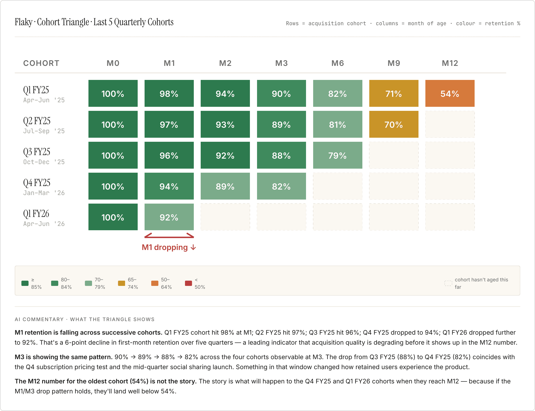
One row per acquisition cohort, one column per month of age. Diagonal patterns show whether recent cohorts are worse than older ones — the early signal that acquisition quality is degrading before it shows up in the M12 number.

Prepare your data

Every recent quarterly cohort with its full retention curve (M0 through as many months as elapsed). Anchor with any real values from PIQ.

Prompt

Build a cohort triangle for [company]. Rows are quarterly acquisition cohorts (oldest at top). Columns are age in months (M0, M1, M2, M3, M6, M9, M12). Cell values are retention % at that age. Cells to the right of the diagonal are blank (that cohort hasn't aged that far yet). Colour each cell on a red-to-green scale by retention %: - ≥ 85%: dark green - 70–84%: green - 55–69%: yellow - 40–54%: orange - < 40%: red Below the triangle, name the pattern in one paragraph — is the top row (oldest cohort) better or worse than the bottom row (newest cohort) at the same age? A newer cohort that's worse than an older one at the same age is a leading indicator that acquisition quality is degrading.

Build a cohort triangle for [company]. Rows are quarterly acquisition cohorts (oldest at top). Columns are age in months (M0, M1, M2, M3, M6, M9, M12). Cell values are retention % at that age. Cells to the right of the diagonal are blank (that cohort hasn't aged that far yet). Colour each cell on a red-to-green scale by retention %: - ≥ 85%: dark green - 70–84%: green - 55–69%: yellow - 40–54%: orange - < 40%: red Below the triangle, name the pattern in one paragraph — is the top row (oldest cohort) better or worse than the bottom row (newest cohort) at the same age? A newer cohort that's worse than an older one at the same age is a leading indicator that acquisition quality is degrading.

Copy prompt

Copied

Output
  1. Diagnose the Decay

Cross the cohort pattern from Step 3 with what product and marketing actually did in the same window. Where the retention data and the founder narrative don't line up is the conversation.

Prepare your data

The cohort triangle from Step 3. Board decks and founder updates covering the same quarters — product releases, pricing changes, marketing shifts.

Prompt

Build a diagnostic for [company]. Two columns: - Left: the retention pattern from the cohort triangle. Which cohort, which month of age, what dropped and by how much. - Right: what the product / marketing did in the same window — feature launches, pricing changes, acquisition channel mix shifts. Pull from board decks and founder updates. Then a Divergence callout — where the founder narrative doesn't address the pattern the triangle shows. Then three questions for the next board, grounded in the gap, answerable with a number or a yes/no.

Build a diagnostic for [company]. Two columns: - Left: the retention pattern from the cohort triangle. Which cohort, which month of age, what dropped and by how much. - Right: what the product / marketing did in the same window — feature launches, pricing changes, acquisition channel mix shifts. Pull from board decks and founder updates. Then a Divergence callout — where the founder narrative doesn't address the pattern the triangle shows. Then three questions for the next board, grounded in the gap, answerable with a number or a yes/no.

Copy prompt

Copied

Output

This analysis was one-shotted with Claude + PortfolioIQ MCP

This analysis was one-shotted with Claude + PortfolioIQ MCP

AI does great analysis, getting the data ready is the hard part

AI does great analysis, getting the data ready is the hard part

AI does great analysis, getting the data ready is the hard part

PortfolioIQ manages your data: extraction from documents, standardization, reconciliation across sources and human checks. Plugs latest, accruate data to wherever you do your work. Claude, ChatGPT, Excel or the PortfolioIQ platform.