COMPANY PERFORMANCE ANALYSIS

Portfolio Burn Analysis

Burn multiple alone is only part of the picture. Here's how to use AI to bolster your analysis - all the way from a 10,000 ft portfolio view down to a single-company.
AI prompt for portfolio burn analysis
  1. Create a portfolio burn dashboard

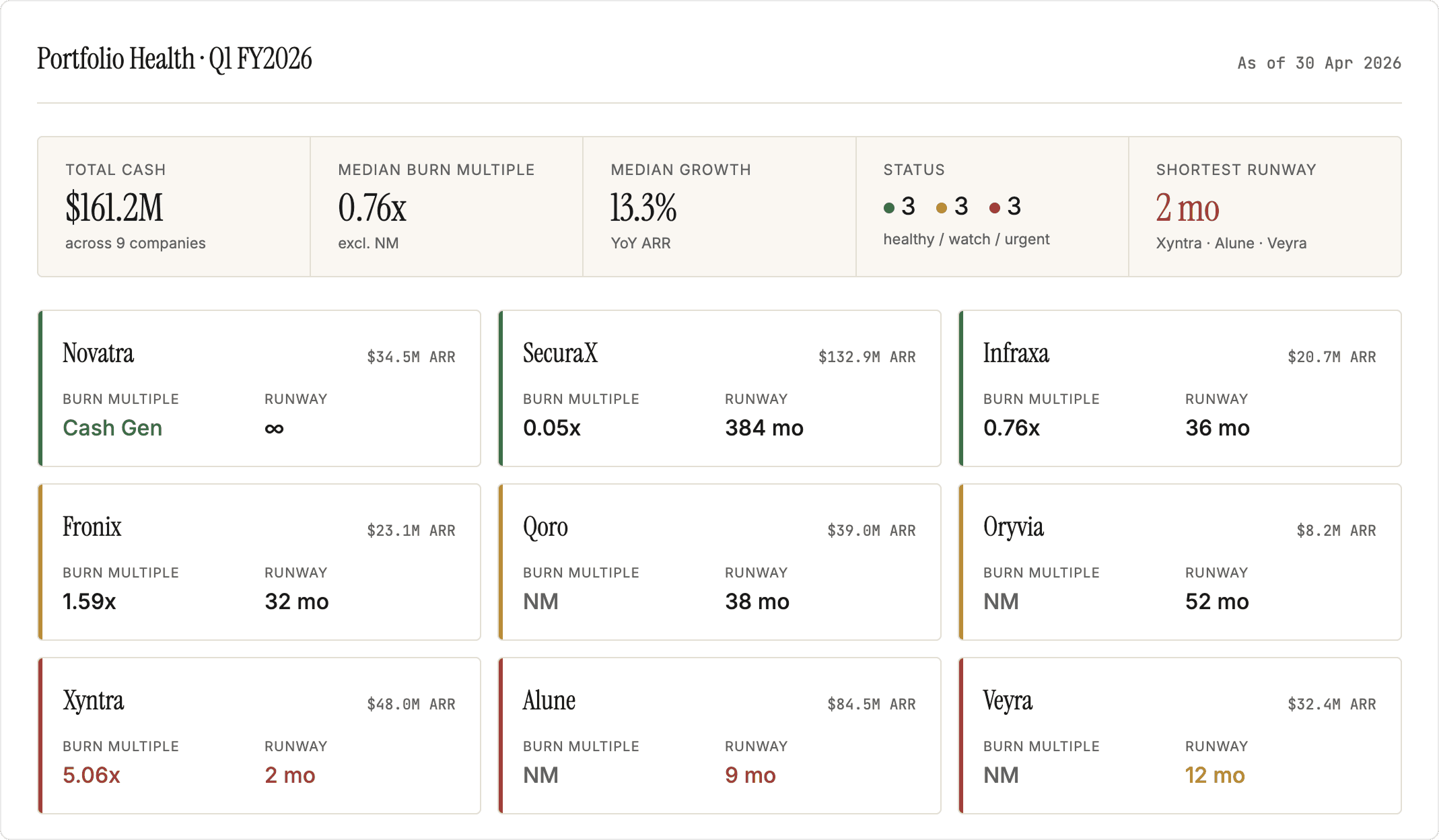
A burn multiple table is the typical analysis. The better version pulls cash, runway, and context onto the same screen and uses color and structure to surface what needs attention before anyone asks.

Prepare your data

One row per company, most recent quarter — ARR, net new ARR, net burn, cash balance, last fundraise date, and amount.

Prompt

Build a portfolio health dashboard. One tile per company, sorted by burn multiple ascending. Each tile shows: company name, burn multiple (with "Not Meaningful" if net new ARR ≤ 0), cash balance, runway in months, and a colored status indicator — green if burn multiple < 1.5x and runway > 18 months, yellow if either threshold is missed, red if both are. Include a portfolio-level header with median burn multiple, count of companies in each status, total cash across the portfolio, and the three companies with the shortest runway.

Build a portfolio health dashboard. One tile per company, sorted by burn multiple ascending. Each tile shows: company name, burn multiple (with "Not Meaningful" if net new ARR ≤ 0), cash balance, runway in months, and a colored status indicator — green if burn multiple < 1.5x and runway > 18 months, yellow if either threshold is missed, red if both are. Include a portfolio-level header with median burn multiple, count of companies in each status, total cash across the portfolio, and the three companies with the shortest runway.

Copy prompt

Copied

Output
Portfolio Health Tracker
  1. Sharpen the view by adding growth context

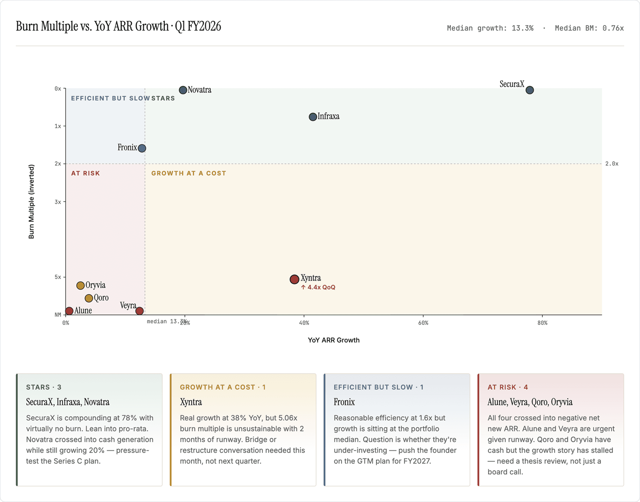
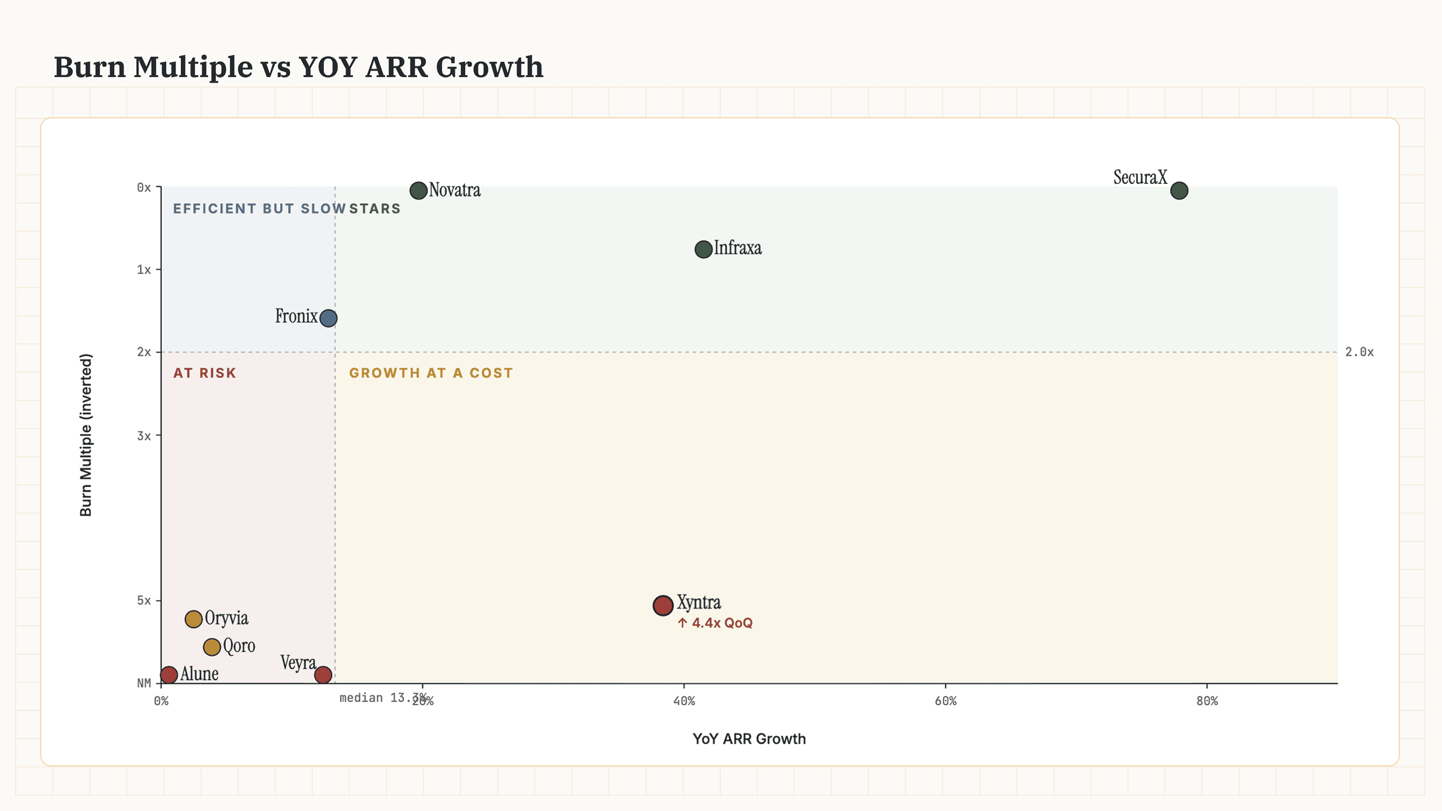
Add a dimension to the analysis with a 2×2 against ARR growth. While burn multiple gives you capital efficiency, it doesn’t tell you if the company is moving fast enough to matter. This view gives you a better comparison across companies.

Prepare your data

Add YoY ARR growth (or QoQ, applied consistently) to your data.

Prompt

Plot a 2×2: X-axis growth rate, Y-axis burn multiple inverted. Vertical reference at portfolio median growth, horizontal at 2.0x burn. Label quadrants Stars, Growth at a Cost, Efficient but Slow, At Risk. For each quadrant, write a 2-sentence read of what's there: which companies, what they have in common, and the one thing I should be doing about that group this quarter.

Plot a 2×2: X-axis growth rate, Y-axis burn multiple inverted. Vertical reference at portfolio median growth, horizontal at 2.0x burn. Label quadrants Stars, Growth at a Cost, Efficient but Slow, At Risk. For each quadrant, write a 2-sentence read of what's there: which companies, what they have in common, and the one thing I should be doing about that group this quarter.

Copy prompt

Copied

Output
Burn Multiple vs. YOY ARR Growth Matrix
  1. Switch from point-in-time to trends

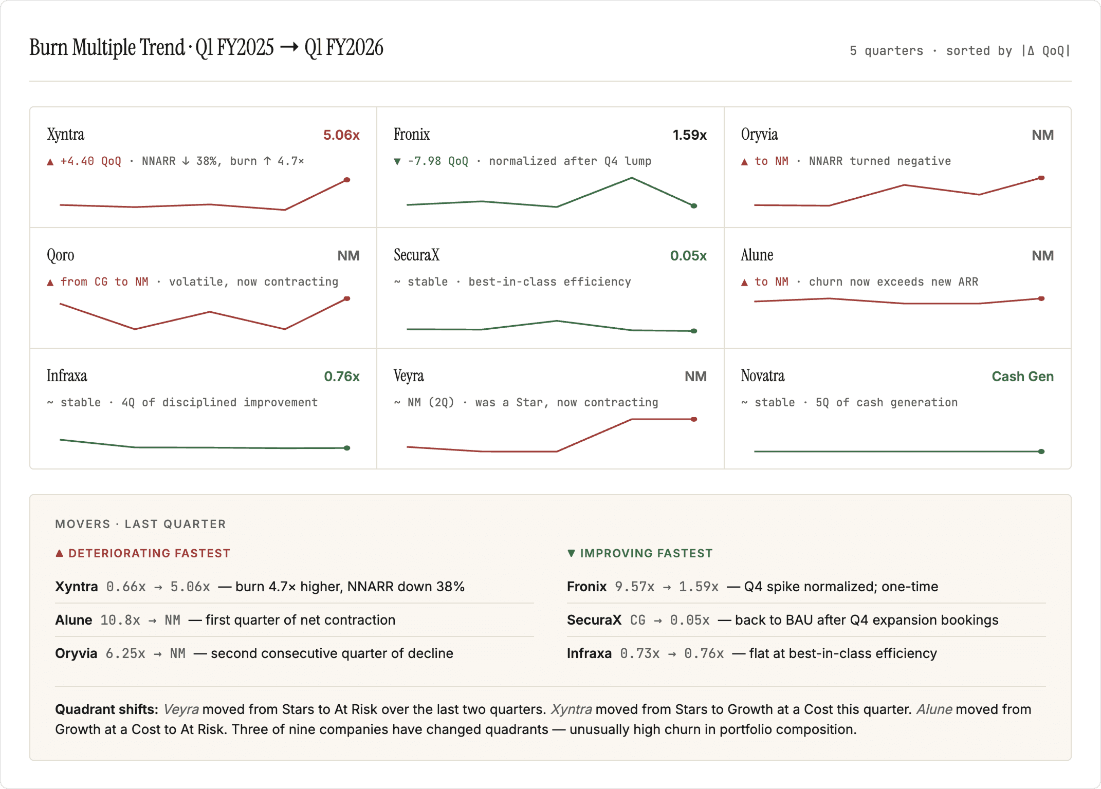
You have an in-depth view on where your companies lie today. But what trajectory are they on? A company drifting from 1.5x to 3x over two quarters is a worth a deeper look than one that's been at 4x forever.

Prepare your data

Add to your data the last 4 quarters of ARR, net new ARR, and net burn for every company. Confirm fiscal year convention per company.

Prompt

For each company, plot the last 4 quarters of burn multiple as a sparkline. Arrange as a small-multiples grid sorted by magnitude of change between the two most recent quarters. Above each sparkline, show the latest value and the delta. Below the grid, write a "movers" summary: top 3 companies whose burn multiple is deteriorating fastest, top 3 improving fastest, and any company that has crossed from one 2×2 quadrant to another in the last quarter. For each named company, one sentence on what changed in the underlying numbers — ARR shift, burn shift, or both.

For each company, plot the last 4 quarters of burn multiple as a sparkline. Arrange as a small-multiples grid sorted by magnitude of change between the two most recent quarters. Above each sparkline, show the latest value and the delta. Below the grid, write a "movers" summary: top 3 companies whose burn multiple is deteriorating fastest, top 3 improving fastest, and any company that has crossed from one 2×2 quadrant to another in the last quarter. For each named company, one sentence on what changed in the underlying numbers — ARR shift, burn shift, or both.

Copy prompt

Copied

Output
Burn Multiple Trend Chart
  1. Diagnose outliers

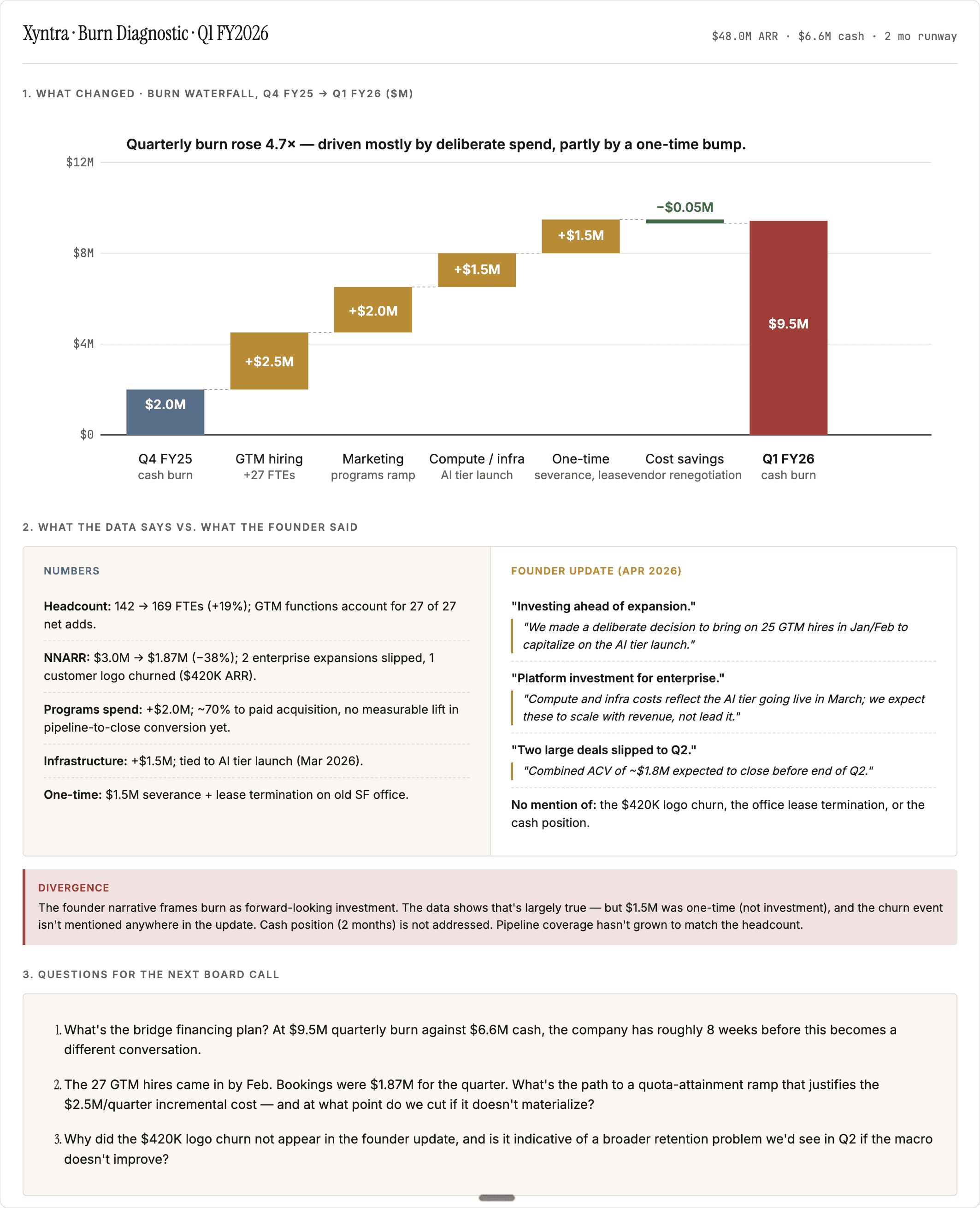
Once you've found the companies that need a deeper look, the question stops being numerical and becomes investigative. Why did burn jump? Was it one-time or structural? Does the founder's narrative match the numbers?

Prepare your data

Last 3 to 4 quarterly board decks, for every company needing deeper analysis.

Prompt

Company's burn multiple moved from 2.1x to 4.7x last quarter. Build a one-page diagnostic. Start with a waterfall chart attributing the change to its components — ARR movement, OpEx category changes, headcount additions. Below the waterfall, a two-column comparison: what the numbers say drove the change vs. what the founder's last update says drove it. Highlight any divergence. Close with three questions I should ask on the next board call, grounded in the specific gaps between the data and the narrative

Company's burn multiple moved from 2.1x to 4.7x last quarter. Build a one-page diagnostic. Start with a waterfall chart attributing the change to its components — ARR movement, OpEx category changes, headcount additions. Below the waterfall, a two-column comparison: what the numbers say drove the change vs. what the founder's last update says drove it. Highlight any divergence. Close with three questions I should ask on the next board call, grounded in the specific gaps between the data and the narrative

Copy prompt

Copied

Output
Burn Waterfall Chart

This analysis was one-shotted with Claude + PortfolioIQ MCP

This analysis was one-shotted with Claude + PortfolioIQ MCP

AI does great analysis, getting the data ready is the hard part

AI does great analysis, getting the data ready is the hard part

AI does great analysis, getting the data ready is the hard part

PortfolioIQ manages your data: extraction from documents, standardization, reconciliation across sources and human checks. Plugs latest, accruate data to wherever you do your work. Claude, ChatGPT, Excel or the PortfolioIQ platform.