COMPANY PERFORMANCE ANALYSIS
Portfolio Headcount Analysis
ARR per FTE looks identical whether the team got better or just smaller. Here's how to use AI to read hiring velocity, function mix, and the gap between numbers and narrative.
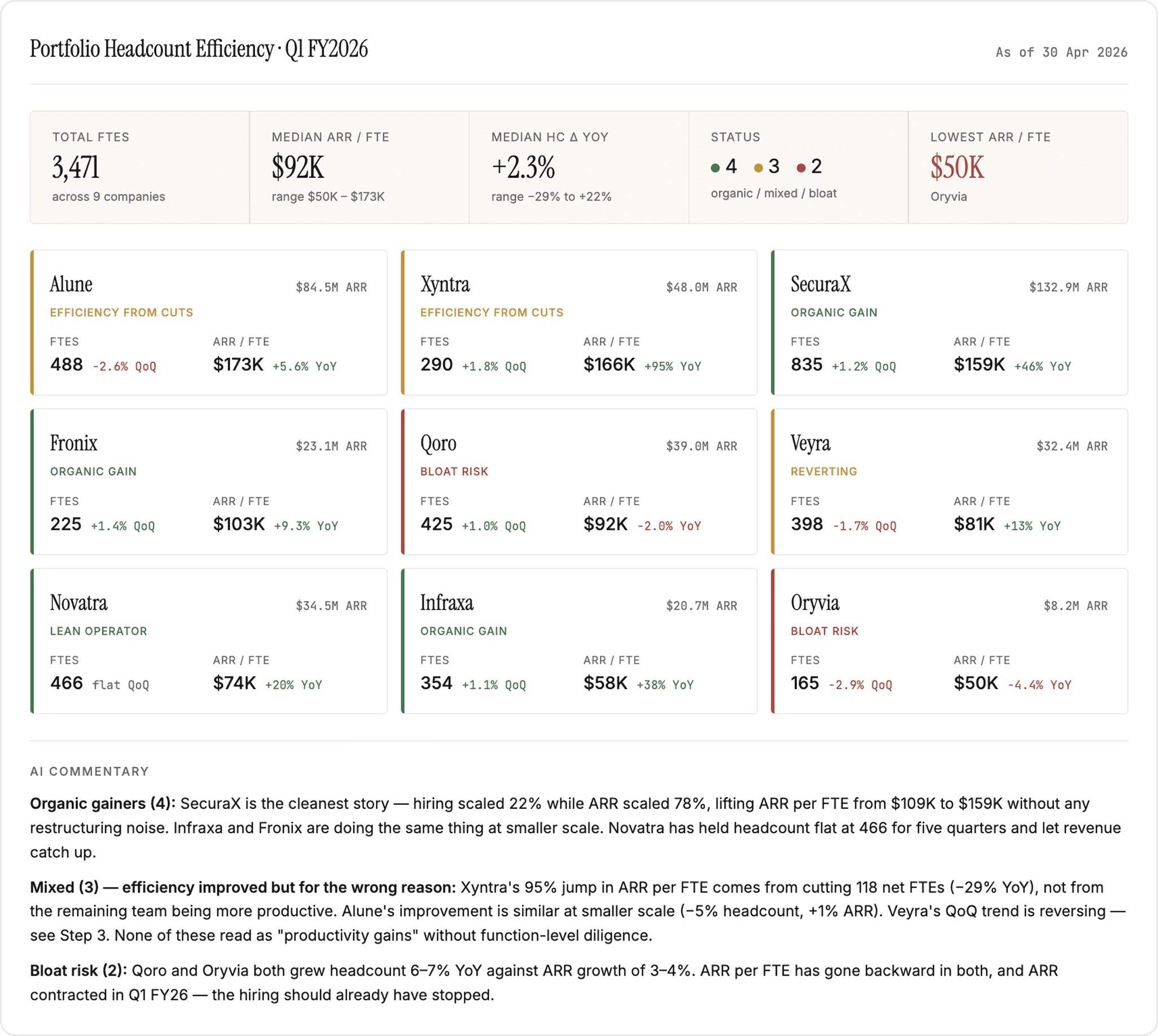
Build a portfolio headcount dashboard
Sort companies by ARR per FTE, then put headcount and hiring velocity on the same screen to separate real productivity gains from headcount cuts.
Prepare your data
Quarterly ARR and headcount per company for the latest two quarters and the year-ago period.
Prompt
Copy prompt
Copied
Output
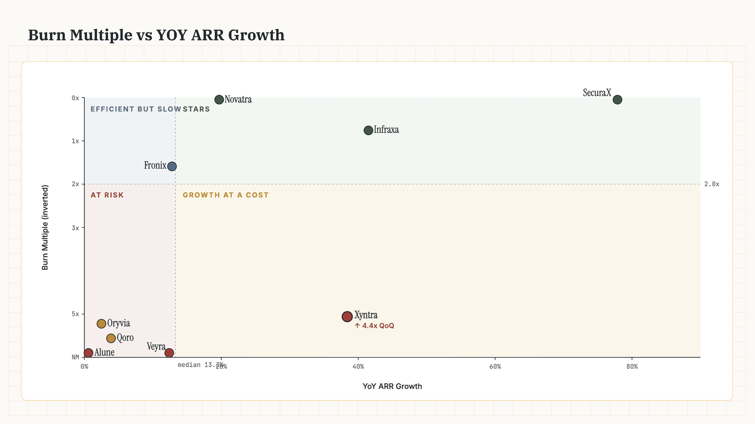
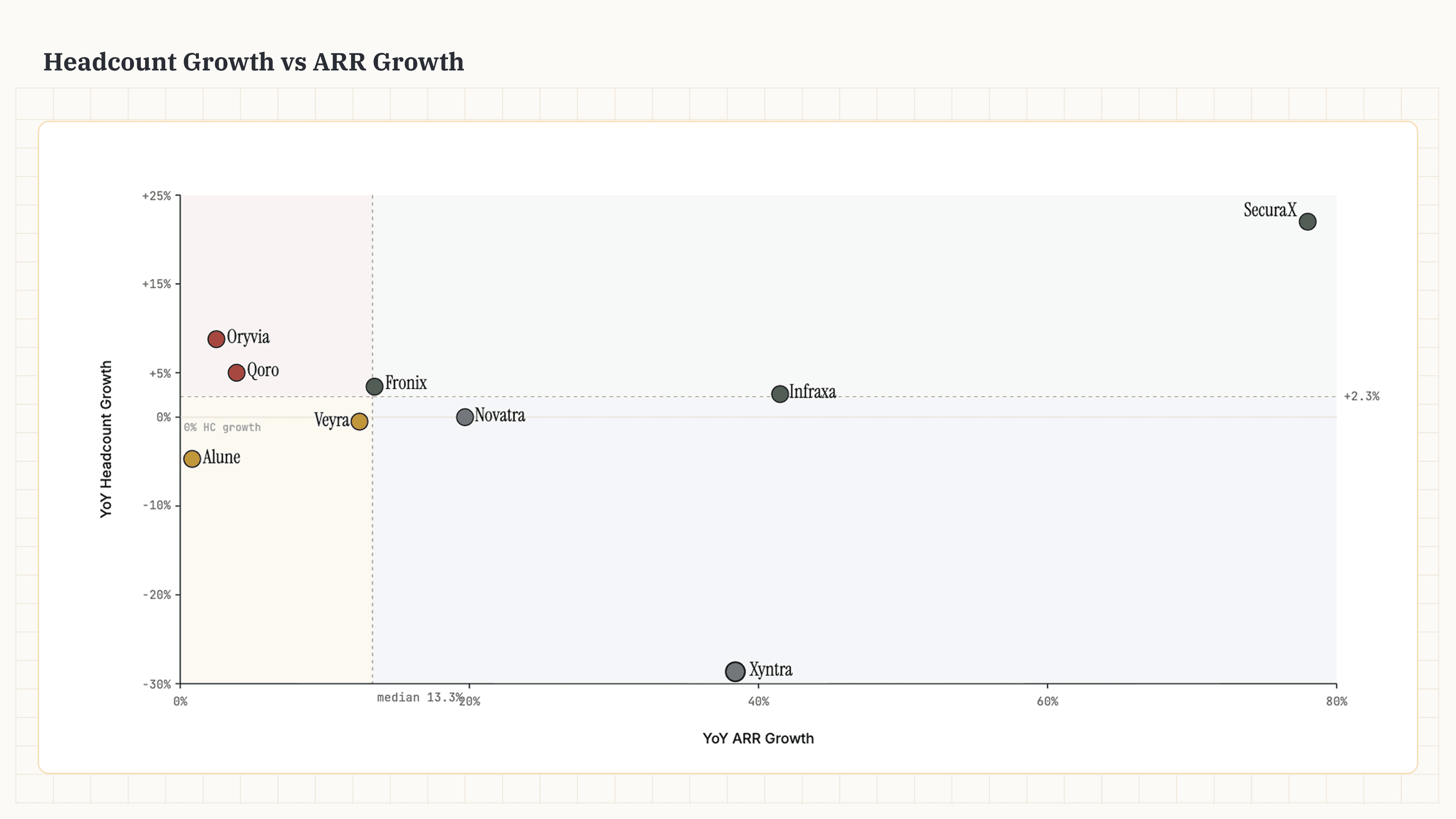
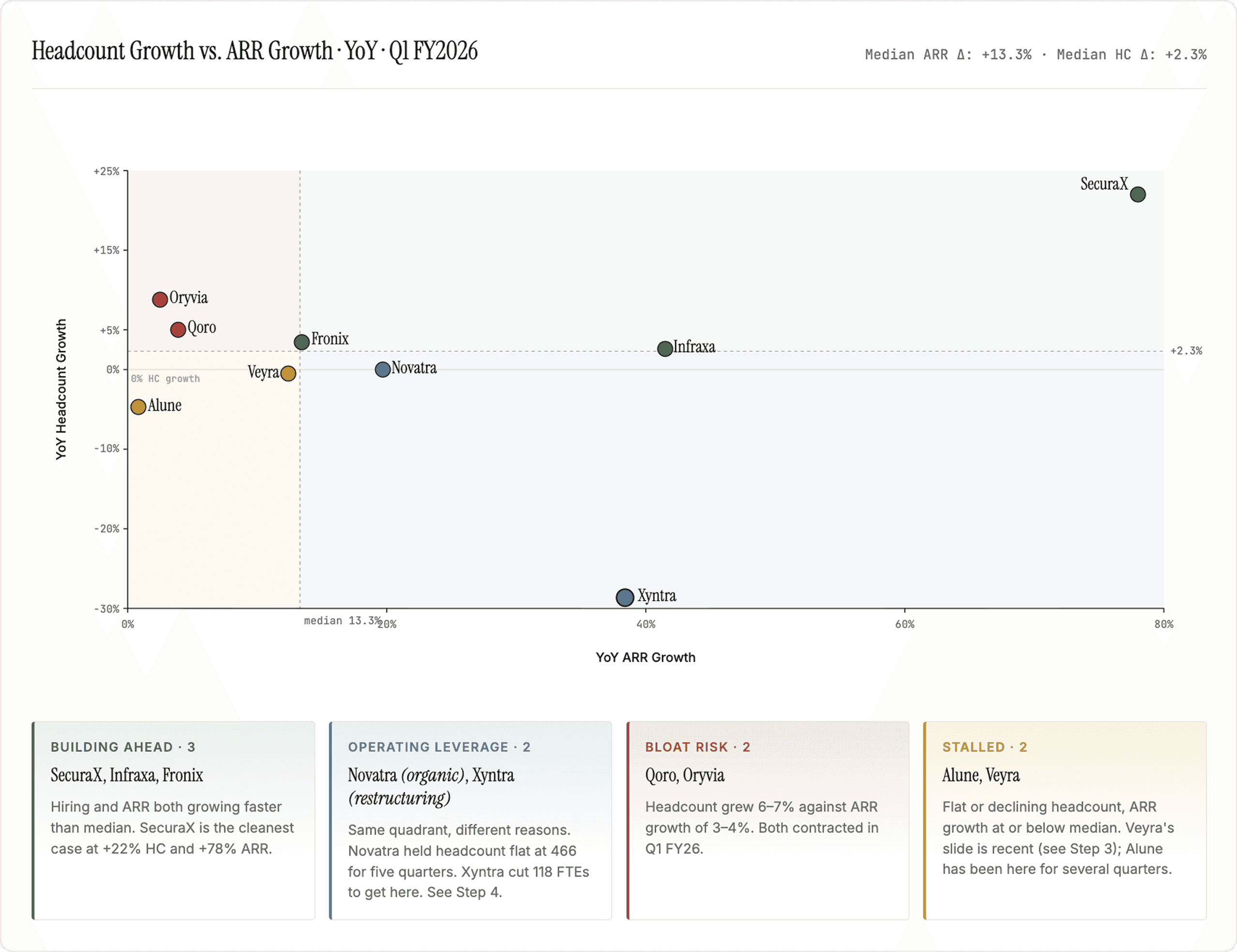
Sharpen the view by comparing hiring to growth
Plotting headcount growth against ARR growth shows the trajectory of the company and identifies companies that are able to convert productivity to growth.
Prepare your data
Year-over-year ARR growth and headcount growth per company
Recent quarterly board updates to provide context behind each company's position
Prompt
Copy prompt
Copied
Output
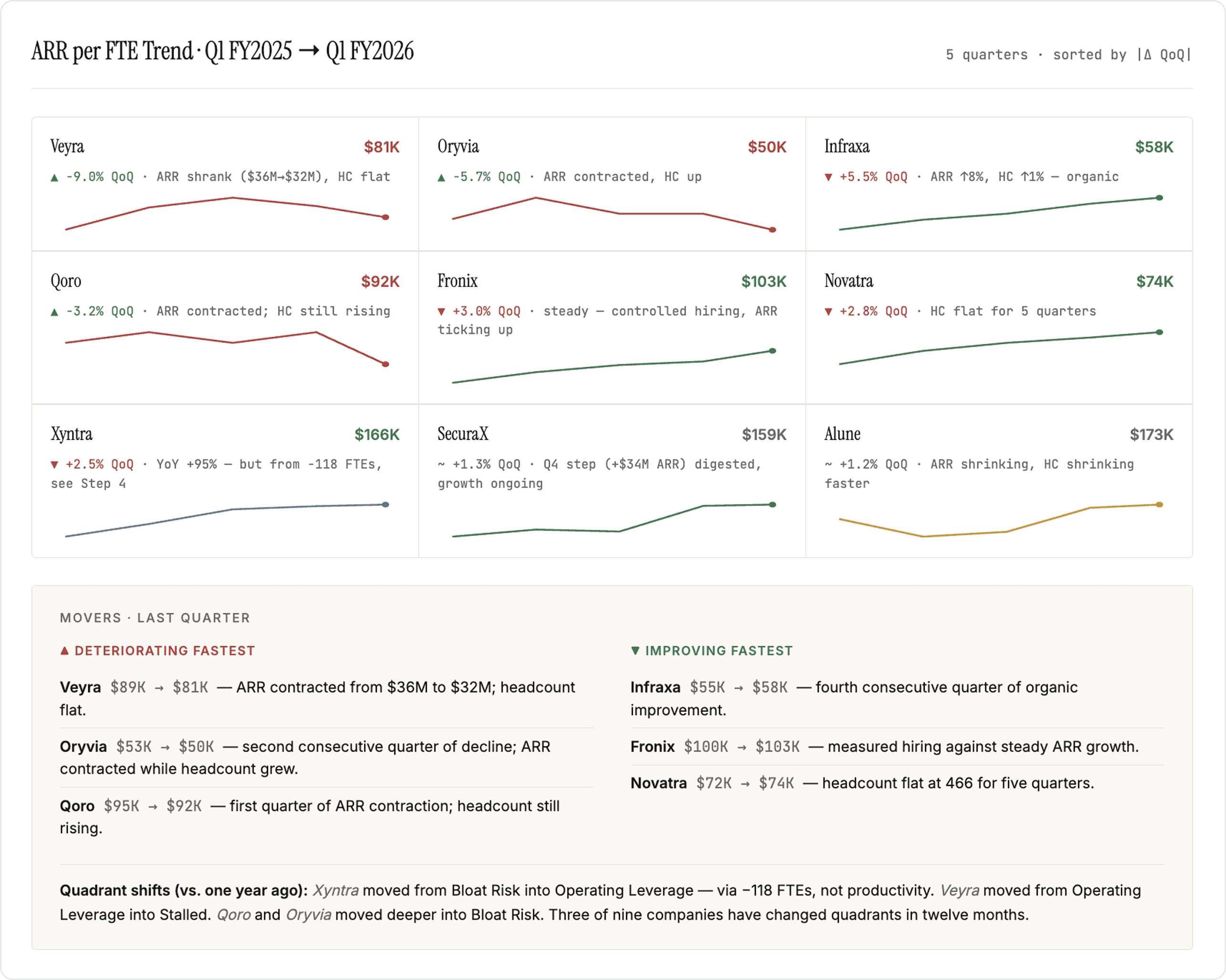
Switch from point-in-time to trends
A snapshot can overstate efficiency for companies that are restructuring and understates it for companies are hiring aggressively. Five quarters of ARR per FTE show whether the gain is sustained or a one-time step.
Prepare your data
Five quarters of ARR and headcount per company
CEO updates and any restructuring memos from the period to attribute each move to its driver
Prompt
Copy prompt
Copied
Output
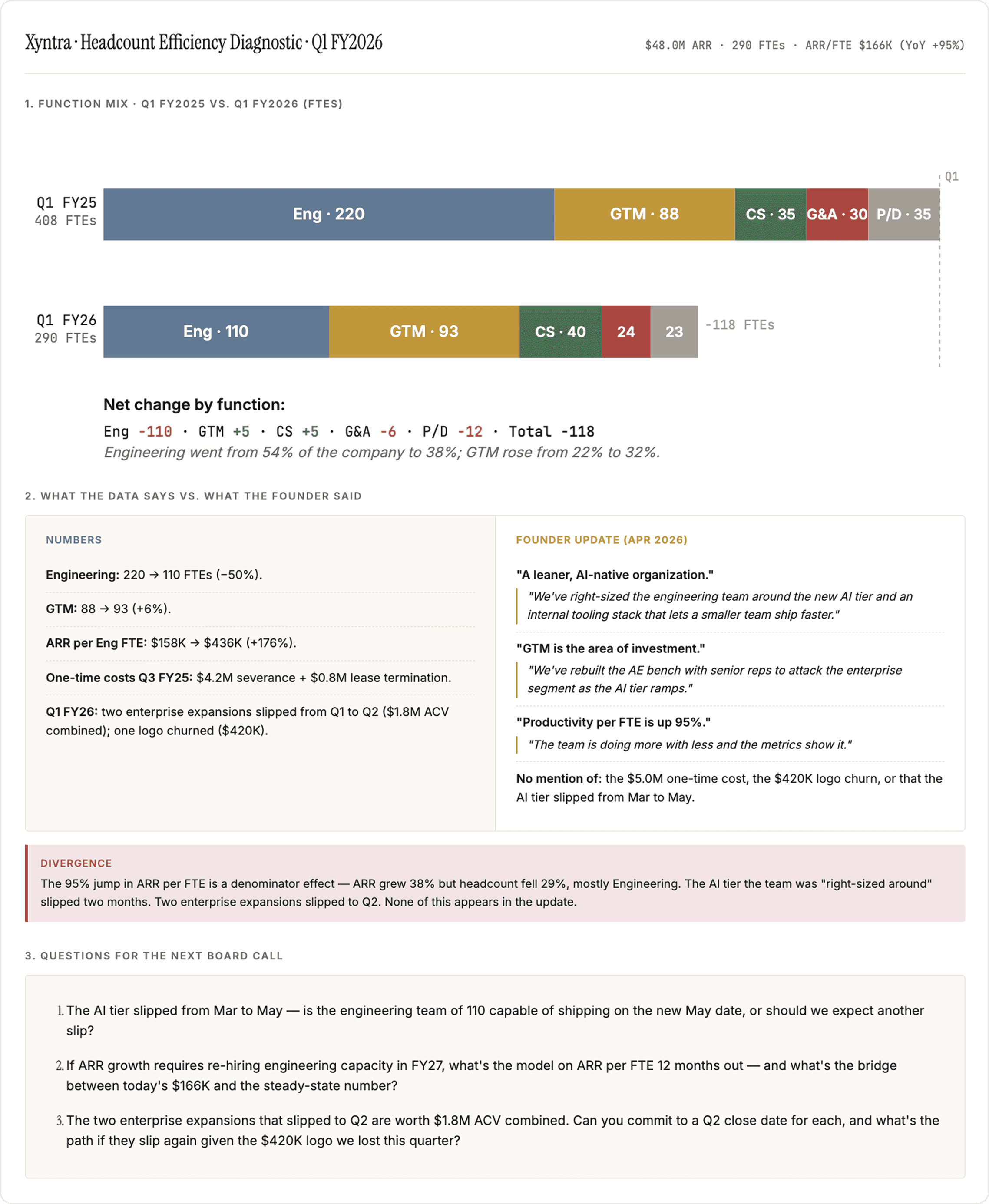
Diagnose outliers
See a company that has seen a massive change in ARR per FTE? Time to dig deeper. The diagnostic: What is the team actually shipping?
Prepare your data
Five quarters of headcount split by function (Engineering, GTM, Customer Success, G&A, Product/Design)
Severance and one-time cost accruals from the financial statements
Two of the most recent CEO updates, board decks, and any restructuring memo from the period
Prompt
Copy prompt
Copied
Output
PortfolioIQ manages your data: extraction from documents, standardization, reconciliation across sources and human checks. Plugs latest, accruate data to wherever you do your work. Claude, ChatGPT, Excel or the PortfolioIQ platform.